iOS 7 Video の内容の書き起こしと日本語訳(寄稿:UIデザイナMorino氏)
今回の記事はUIデザイナの Morino@WWDC2013参加中 に寄稿いただきました!
Appleの公式サイトに iOS 7 を紹介するビデオが公開されましたね。
http://www.apple.com/ios/ios7/
特に前半の4分間でジョナサン・アイブ氏により語られているiOS 7の説明部分に、今回の大きなデザイン変更の様々な要点が含まれており、これからのアプリ設計のあるべき方向性が示唆されています。
これらをよく理解しておくことが非常に重要だと感じていますので、自分自身の復習のためとみなさんへの展開の意味で、書き起こし&和訳を行いました。
デザイナのみならずアプリ開発者の皆様にも有用かと思いますので、ぜひご参照ください。
iOS 7 Video - 書き起こし & 和訳
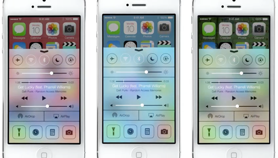
※ 画像はすべて iOS 7 Video の中からの抜粋です
We have always thought of design as being so much more than just the way something looks.
私たちは常にデザインを、ただ外見がどう見えるかよりも遥かに大きな存在として捉えてきました。
It’s the whole thing the way something actually works on so many different levels.
デザインは、様々なレベルにおいて何がどう作用するかという、その全てを指すのです。
Ultimately of course, design defines so much of our experience.
最終的には、デザインは私たちが体験する物事のあまりに多くを定めるのです。
I think there is a profound and enduring beauty in simplicity, in clarity, in efficiency.
シンプルであること、明瞭であること、効果的であることには深い、持続的な美しさがあると考えています。
True simplicity is derived from so much more than just the absence of clutter and ornamentation.
真にシンプルであることとは、ただ装飾と煩雑さが不在であるということよりも、もっと多くの事柄から引き出されます。
It’s about bringing order to complexity.
複雑さに秩序をもたらす、ということを意味するのです。
iOS 7 is a clear representation of these goals.
iOS 7は、これらのゴールの明確な回答となります。
It has a whole new structure that is coherent, and it is applied across the entire system.
首尾一貫した完全に新しい体系であり、システムの全てに渡って適用されています。
We’ve considered the tiniest details, like refining the typography.
タイポグラフィを洗練させたように、本当に小さな細かいディテールにまで配慮しました。
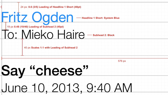
To much larger ones, like redesigning all the icons, and developing a grid system allowed us to acheive a much more hamornious relationship between individual elements.
大きなもので言うと、アイコンのリデザインがあります。グリッドシステムを作りあげることで、個々のエレメントに調和の取れた関係性を生み出すことを可能にしました。
We’ve also incorporated a whole new palette of colors.
全く新しいカラーパレットの導入も行いました。
Distinct functional layers help establish hierarchy and order.
異なる機能のレイヤーは、ヒエラルキーと順序をもたらします。
And a use of translucency gives you a sense of your context.
そして半透明の効果は、状況や文脈の察知を手助けします。
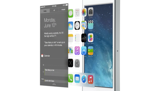
These planes combined with new approaches to animation and motion, create a sense of depth and vitality.
アニメーションとモーションに対する新しいアプローチも含んだこれらの表現により、奥行きと活気を感じられるようになります。
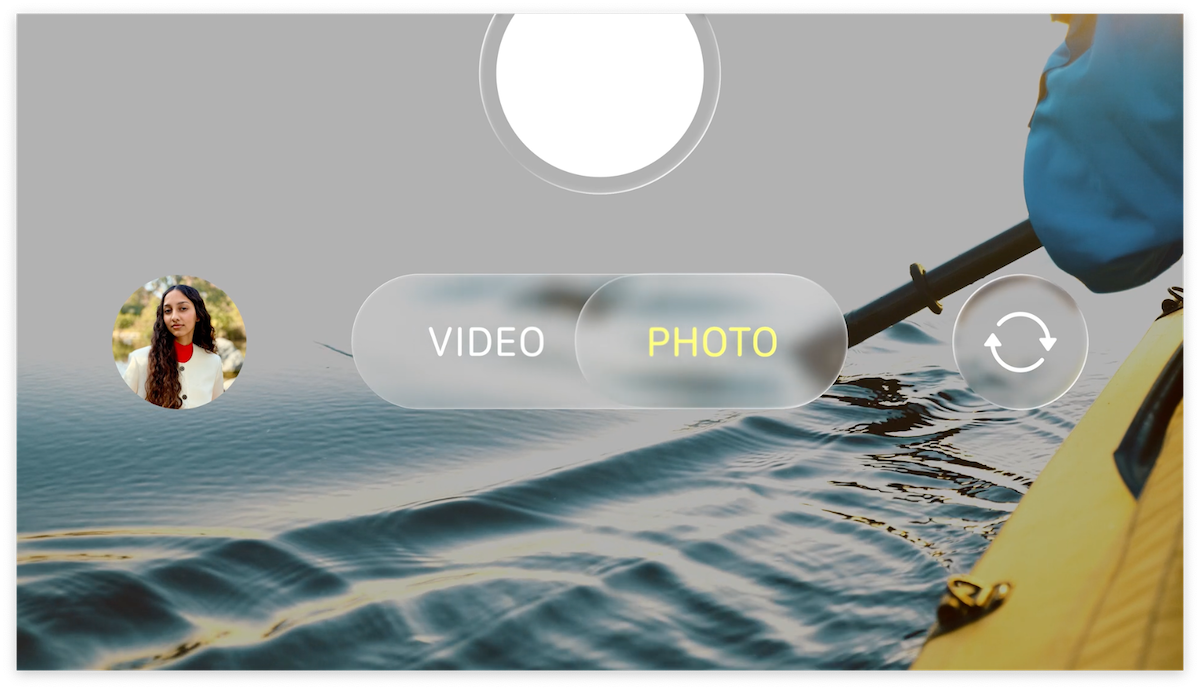
The iPhone responding to your movements, drives the parallax to create a whole new experience of depth.
iPhoneがあなたの動きに応答する形で、視差効果を用いた全く新しい奥行感を体験できるようになります。
In many ways, we’ve tried to create an interface that is unintrusive and deferential.
私たちはあらゆる方法で、押し付けがましくない、丁寧なインタフェースを作り出そうとしてきました。
One where the design recedes, and in doing so, actually elevates your content.
デザイン要素が後退し、薄れていくことで、実際にはコンテンツそのものが引き出されるのです。
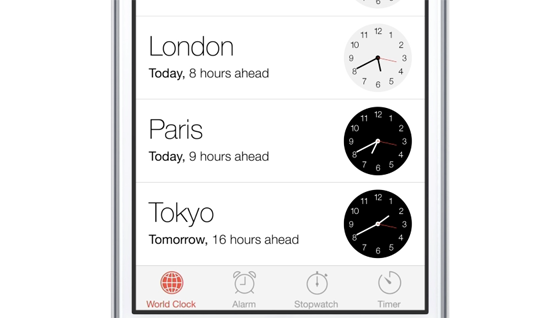
Even the simple act of changing your wallpaper has a very noticeable effect on the way your iPhone looks and feels across the entire system.
壁紙を変えるようなほんの簡単な変更も、iPhoneのシステム全体を通して、そのルック&フィールに目を引く変化を及ぼすのです。
While iOS 7 is completely new, it was important to us to make it instantly familiar.
iOS 7が完全に新しいものであっても、瞬時に慣れ親しんだものに見えることが重要でした。
We wanted to take an experience that people know very well and actually add to it to make it useful, to make it more enjoyable.
より使いやすく、より楽しいものであるために、みんなが既によく知っているコトであり、そしてさらに新しいコトを加えていくことのできるものとしたかったのです。